Impulse AppTrader
Balancing technical complexity with simplicity for financial trading users
Duration
4 months
Role
End-to-End UX/UI Designer
Team
Product Owner, UX/UI Designer, Technical Support Team
Overview
Impulse AppTrader is a mobile application for financial trading. The project was tackled using a dual, simultaneous design approach to ensure business continuity while planning for the future: Modular Optimization (V1.0) for incremental updates and new flows without altering the current architecture, and Strategic Evolution (V2.0) for a comprehensive visual and structural redesign.
The Challenge
The trading ecosystem requires managing an extremely high density of critical information: complex account balances, real-time charts, and high-risk transaction execution. The core UX challenge was: How to design an interface robust and advanced enough for seasoned traders, while remaining intuitive and accessible (newbie-friendly) for beginners?
The Solution
By applying the principle of Progressive Disclosure, we designed a clean layout where basic metrics and critical actions are visible at first glance, while complex technical tools and analytics are stored under-demand in secondary menus. Immediate customer problems were solved via modular updates (V1.0), while the visual identity was revamped in the ground-up makeover (V2.0).
The Core Problem
Traders must make high-stakes, split-second decisions in a high-density information environment. Novice users feel intimidated by visual clutter and advanced jargon, leading to user drops and high support volumes, while experts need advanced features quickly without aesthetic distractions.
User Research
Combining quantitative data with technical support tickets to outline friction.
Research Methods
- •Quantitative Surveys (Active Users)
- •Qualitative Support Desk Audits
- •One-on-One User Interviews
- •Interactive Usability Testing
Participants & Sources
120+ active mobile traders, 8 customer service agents
Key Findings
Beginner users felt overwhelmed and confused by the sheer volume of numbers on screen.
The customer support team spent over 40% of their time explaining basic user interface flows (such as opening or closing a trade).
Professional and expert traders felt the application was lacking advanced technical indicators and quick-execution shortcuts.
Friction in the identity verification and deposit screen was causing a 35% drop-off rate among newly registered users.
Direct User Insights
"When I open the app for the first time, I feel like I need a PhD in finance just to figure out how to buy a stock."
— Beginner Trader
"We spend more time explaining where buttons are in the UI than solving actual financial or transaction issues."
— Support Agent
Design Strategy: Progressive Disclosure
To resolve the conflict between newbie and expert profiles, we segmented the layout strictly by relevance.
1. Clean Interface
Basic info (portfolio value, primary action triggers) are cleanly visible at first glance.
2. Content On-Demand
Advanced metrics, professional charts, and technical controls are neatly hidden behind accessible secondary tabs.
3. Safe Curving
Novices avoid screen anxiety, while expert day-traders have everything they need in a couple of clicks.
Proposed Interaction Layouts
Bifurcated order panel: simple tap-to-buy vs. advanced option sheets.
Customizable dashboard widgets based on user trading experience.
Context-aware onboarding tutorials explaining critical charts.
Consolidated account metrics using micro-charts and progress bars.
UX Design Process
A dual-lane, user-centered methodology structured for incremental value and future visual redesign.
Research & Audit
Conducted surveys with 120+ active traders and structured support ticket audits to pin-point usability bugs and cognitive load limits.
Information Architecture & Flow Layouts
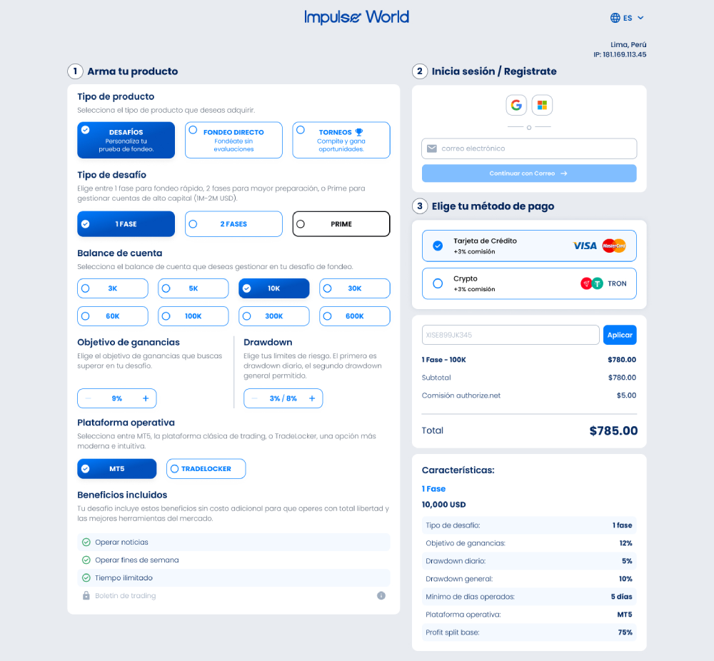
Redesigned the complex buying/selling flow into a clean 3-step wizard with contextual guides for high-risk operations.
High-Fidelity Interface Prototypes
Created dark-themed mockups with neon color-coded tags and responsive micro-interactions to emphasize live asset valuation fluctuations.
Usability Testing & Deployment
Conducted interactive testing sessions with two target groups to refine details. Deployed modular fixes (V1.0) and began the V2.0 framework roadmap.
Key Design Decisions
Strategic visual and structural choices tailored for traders.
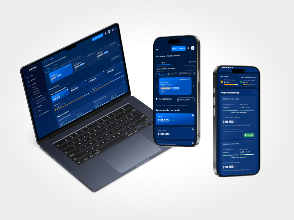
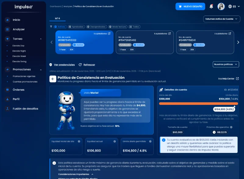
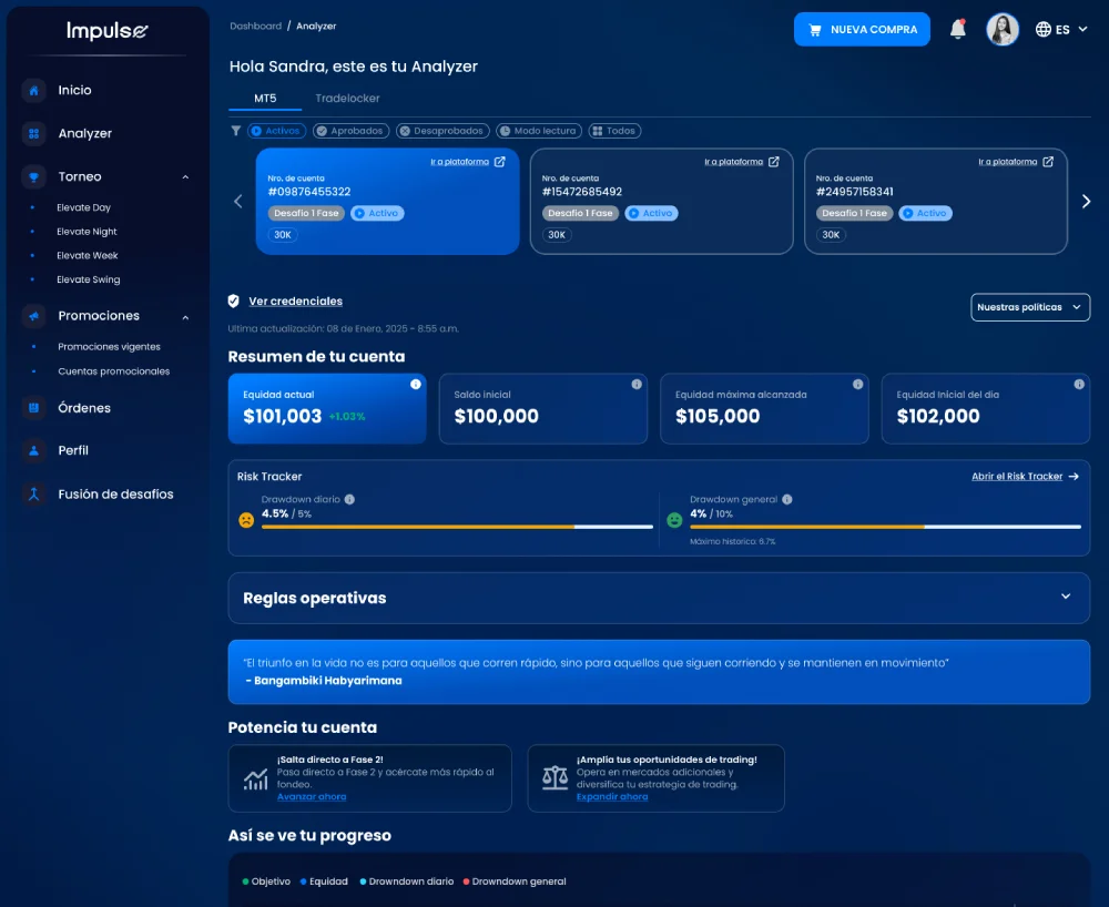
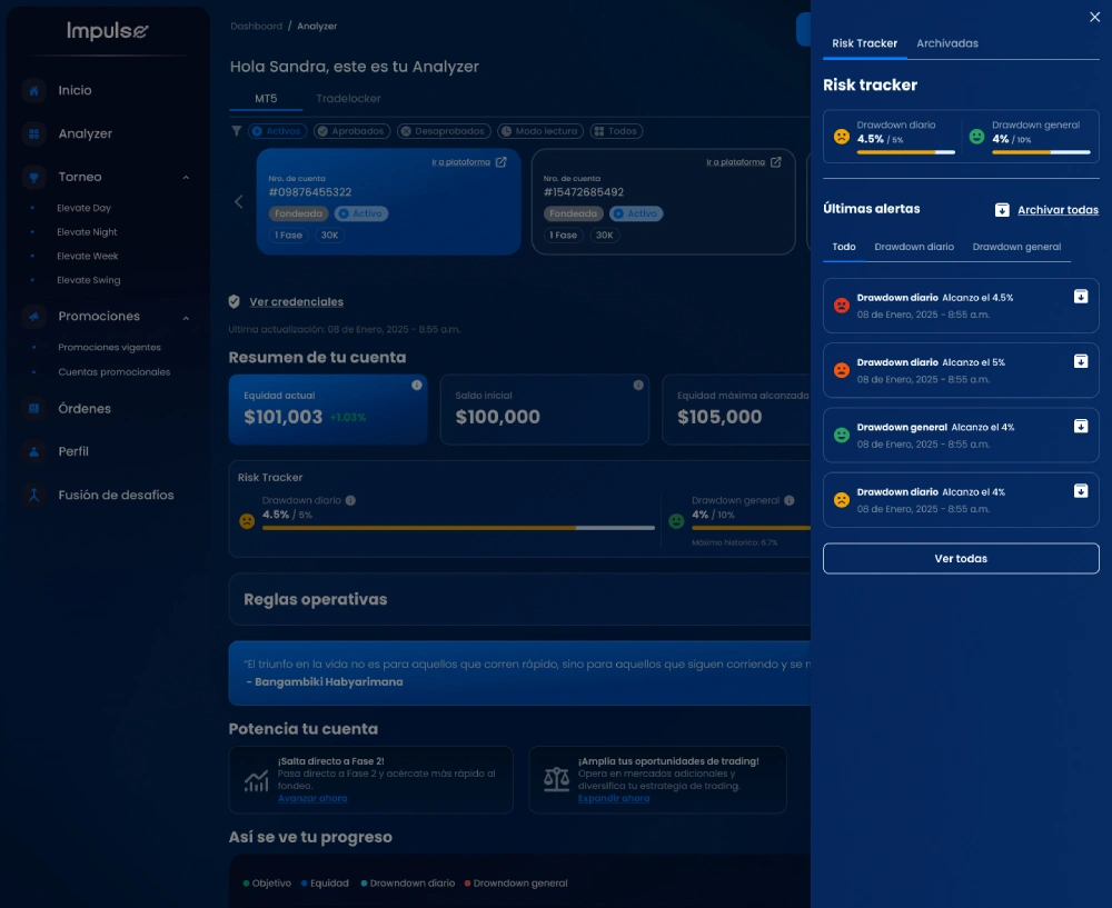
Progressive Disclosure Dashboard
Maintains a clean dashboard for beginners (showing balances and top gainers) while giving experts quick access to depth charts and MACD/RSI indicators in secondary toggles.
Dual-Path Execution Engine (V1.0 & V2.0)
Rather than waiting for a full makeover, immediate UX fixes were implemented directly as modular patches in V1.0 to address support tickets, while designing V2.0 from scratch.
High-Contrast Live Status Indicators
Utilized neon reds and greens optimized for accessibility to clearly signal balance fluctuations and order status, reducing accidental transaction mistakes.
Usability Testing Results
We tested the high-fidelity prototypes with both beginner and veteran day-traders, requesting them to open a trade under time constraints, read technical indices, and modify watch lists.
16 moderated testing sessions (8 beginners, 8 expert traders)
100% of beginner participants successfully set up a wallet and executed a trade without reading external guides.
Veteran day-traders reported locating indicators (like RSI and volume maps) 50% faster than in the legacy interface.
Average task completion time for opening a buy/sell limit order dropped from 45 seconds to just 12 seconds.
Visual clarity and aesthetics rating grew from 2.4/5 to 4.8/5 on average.
Impact & Metrics
Support Tickets
Drastic drop in questions related to navigation confusion and transaction flows.
New User Retention
Increase in first-month active retention due to a smoother learning curve.
Operational Downtime
Ensured by executing modular upgrades directly over the legacy systems during the V2.0 design.
Learnings & Takeaways
Reflections and product strategy insights gained from the dual track development.
UX design goes beyond aesthetics: it is about understanding the user's cognitive bandwidth and the system's technical constraints.
Progressive Disclosure is the ultimate pattern when designing systems that cater to extreme gaps in user experience levels.
Incremental rollouts prevent change-shock: upgrading critical items first secures customer trust while major redesigns build.
Next Steps
Roadmap features scheduled for subsequent releases.
Implement AI-driven personalized finance tips and automated trading insights.
Expand the design system documentation to cover multi-monitor desktops for pro traders.
Integrating 2.0 functions and designs in phases without disrupting the user's workflow and increasing the dropout rate.